UX/UI · E-commerce · Healthcare · Conversion
Reimagining the Online Pharmacy Experience
A full rebuild of the path from landing page to confirmed order, designed so people can judge a medication, a price and a prescription requirement before they are asked to commit.
- Role
- UX/UI Designer
- Tools
- Figma, WooCommerce
- Platform
- Responsive web
Scroll to explore ↓
10 brands
Shared UX/system approach
Requirement surfaced before checkout
Dosage, quantity & price consolidated
Responsive web + WooCommerce
01 — Overview
An e-commerce problem wearing healthcare constraints
The store sold prescription and over-the-counter medication to customers who were price-sensitive, often anxious, and mostly on a phone. Every page had to do two jobs at once: sell, and inform accurately enough that nobody ordered the wrong thing.
My remit covered the full journey — homepage, category, product detail, prescription upload, dosage and quantity selection, cart, checkout, savings calculator, trust content and the mobile experience.
Designed for
Representative user profile
Priya, 42
Chronic prescription refiller
Goal — reorder her usual medication in under a minute without re-explaining dosage or history.
Frustration — comparing strengths and quantities across tabs because the product page would not let her compare in place.
Representative user profile
Marcus, 27
First-time over-the-counter buyer
Goal — know whether a product needs a prescription before he commits to buying it.
Frustration — discovering the prescription requirement only after reaching the cart.
02 — Challenge
Simplify the journey without removing important healthcare information
Understanding
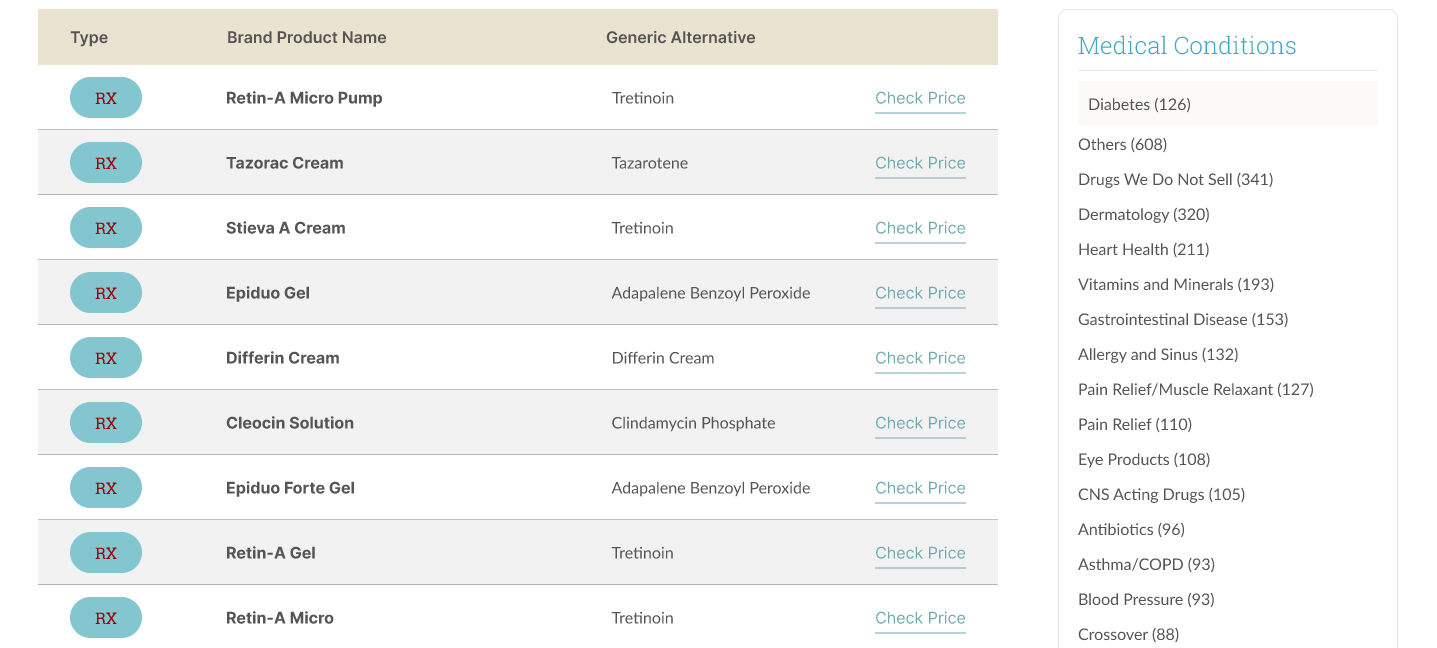
Product names, strengths and pack sizes read as a wall of near-identical options.
Pricing
Savings were the reason to buy, and they were the hardest thing on the page to find.
Prescriptions
Nothing on the page explained what a prescription requirement meant for the order.
Confidence
Buying medication online is a trust decision before it is a purchase decision.
03 — Research & insights
What the drop-offs were actually telling us
- 01
People compared strengths and quantities across tabs because the product page would not let them compare in place.
- 02
The prescription step surfaced too late — after the cart, where it reads as an obstacle rather than a requirement.
- 03
Trust signals existed but sat in the footer, far from the moment of hesitation.
- 04
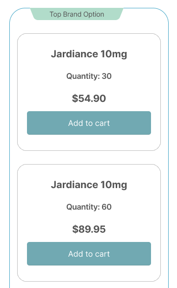
On mobile, the add-to-cart control was below three screens of regulatory copy.
“I just want to know if I need a prescription before I put anything in the basket.”
04 — Architecture & flows
Restructured so the requirement arrives before the commitment
Discover
Category with condition and strength filters
Decide
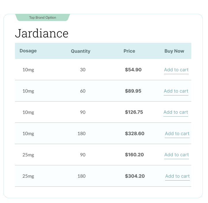
Dosage, quantity and price in one block
Prescription
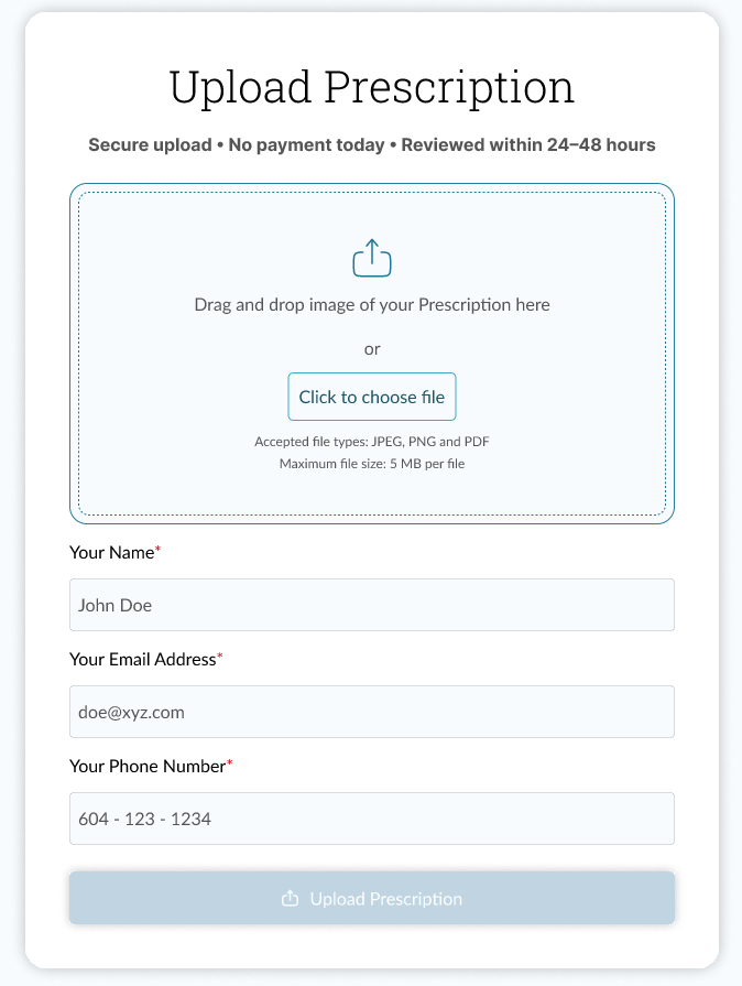
Requirement stated, upload offered inline
Cart
Totals, savings and next steps visible
Checkout
Single column, no surprise fields
Before
Fragmented navigation
After
Clear information hierarchy
Before
Unclear product information
After
Structured product details
Before
Prescription step discovered at checkout
After
Requirement and upload on the product page
05 — Interface
How the key screens were structured


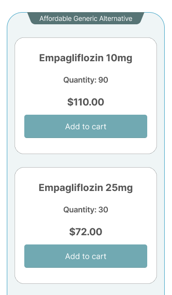
06 — Design system
Components that survive ten brands
Product cards, dosage selectors, prescription notices, price blocks and trust panels were documented as components with states, so sister sites could adopt the journey without redrawing it.
07 — Outcome
What changed for customers
Prescription requirements were surfaced before checkout, eliminating a major source of surprise during purchase.
Dosage, quantity and price became comparable without leaving the product page.
The pattern was documented for reuse across multiple pharmacy brands.
What worked
Moving the prescription requirement onto the product page meant nobody discovered it at checkout, and putting dosage, quantity and price in one block let people compare without leaving the page.
What I would change
The savings calculator was designed late, as an addition to the product page. Designed earlier, it could have shaped how the category page itself was structured.